The Mother of Toads
Posted: June 26, 2018 Filed under: Uncategorized 1 Comment
I can’t remember if I have mentioned this yet, but I’m currently working on a digest-sized comic book based on Clark Ashton Smith’s short story, “The Mother of Toads” for (hopeful) release at Gencon in early August (knock on wood). 16 pages in black and white… possibly there will be a color cover depending on cost.
This makes the third “Appendix N” author story that I have adapted to comic book form (last year I released Lovecraft’s “Dagon” and I also adapted A.E. Merritt’s “People of the Pit” to a comic book — both will be appearing in Tales from the Magician’s Skull magazine). Eventually I hope to publish a horror collection of these comics so if you missed out on the originals, do not despair.
There is some nudity and toad sex … so be warned. “The Mother of Toads” is one of CAS’s less well known stories, and, AFAIK, I am the first to have adapted it to comic book form. I was excited to see that there was a film short adaptation (part of the 2011 horror anthology film, ‘The Theatre Bizarre“), When I rented “The Theatre Bizarre,” I found myself underwhelmed. “The Mother of Toads” segment was, in my opinion, pretty good (although they made some narrative choices I wouldn’t have), but, after watching 2 more segments, I got bored with “The Theatre Bizarre” and gave up. I’m pretty hot-and-cold when it comes to horror… sometimes I enjoy it a great deal, but some stuff (particularly slasher horror) just bores me, so take my review with a grain of salt.
Den of Iniquity
Posted: June 23, 2018 Filed under: Uncategorized Leave a comment
For an upcoming project. India ink and gouache on paper.
Beast
Posted: June 22, 2018 Filed under: Uncategorized Leave a comment
Upcoming project work in progress.
Tiger women WIP painting
Posted: June 12, 2018 Filed under: Uncategorized 1 CommentWork in progress of a recent commission for DAMN Magazine. The subject is ‘Tiger women” who inhabit a jungle environment on the front cover and a great snake on the back cover. The whole is to be painted as one picture using acrylics and washes on stretched watercolor paper. The paper will rumple when I apply the paint so I have to soak it, staple it down onto a piece of plywood and then let it dry before I start painting.

We start with a pencil sketch on stretched watercolor paper. When printed, the front and back cover will be split down the middle. Details are to include a tall, tower-like temple structure and a thick jungle. This is the pencil underdrawing which is ~80% done. With sketches to figure out the layout, etc., this represents 4 to 6 hours so far.

Once the pencil is complete and I am sure I have all the details where I want them, I start working in thinner washes of color. I think this is probably the most critical part of the painting… normally I grow impatient and want to dive in and start painting whatever I find more interesting, but when I do so I usually end up screwing it up. Through experience, I’ve decided I get better results if I start working the overall painting first, trying to work in shadow areas and the background gradually and building up layers of color. I’m guessing we are at eight or nine hours so far.

Once I have the first layers of background and environment done, I can start working on the figures and other elements. I don’t have lots of specific rules as to the order I work on things, but I like working cool colors into shadow areas in order to give it a more atmospheric effect and I have had more success in layers darker colors over lighter ones rather than vice-versa. In addition, foreground elements get a shorter edge and outline and greater contrast than background elements.
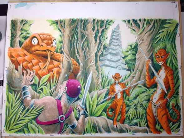
I’m reaching the point where everything has at least some paint on it. One of the obvious advantages to painting the ‘tiger women’ after I paint the trees and plants they are standing in front of is that I can get a crisper edge on the foreground figures that helps them feel more defined. I’m liking the way the orange figures are looking against the green of the forest but think the tiger women of the front cover and the giant snake of the back cover are too similar in color so I want to fix that… I want to make them “the same but different.” I’ve been working on the painting for around 15 hours at this point.

The final painting in a good quality scan. Previous images were just photos taken with my mobile phone (I can’t scan the painting while it is attached to the plywood), so the colors in previous photos are are not as vibrant. I went over the snake with a thin wash of yellow… I think it looks much better. The last hour or so is spent on going over it and fixing little things or using various shades of white, blue and brown to pick out shadows and highlight areas. The treatment of the temple/tower is ‘just about right’ at this point in my opinion and I have to remind myself not to work on it too much… I feel like it currently has just the right amount of detail… too much more and it will compete too much with more foreground elements. My favorite part is probably the way those twisty tree trunks frame the temple. The last thing I do is add my initials to the lower RH corner. In total I probably spent about 20 hours total on this from start to finish.
White on Black
Posted: June 4, 2018 Filed under: Uncategorized Leave a comment
Got a lot of stuff I am working on, but here is something recent for an upcoming project (look for it in early August). Drawing in white on black is a lot of fun… one of my goals for the future (when and if I ever get caught up) is a series of wood block/lino prints in 2 or 3 colors, printed in editions of maybe 50 or 100 to keep the prices low.
Necronomicon pop up book
Posted: June 4, 2018 Filed under: Uncategorized Leave a comment

About a year ago I ordered Skinner’s Necronomicon pop-up book (I think it was a kickstarter or pre order or whatever) and forgot about it until it came in the mail today. What a nice surprise for me! Five illustrations from five different H.P. Lovecraft tales with pop-up elements… like fun little paper sculptures you can open up on your lap and then close and put away on the shelf.
Pop up book: https://www.necronomiconpopup.com
Art of Skinner: http://www.theartofskinner.com
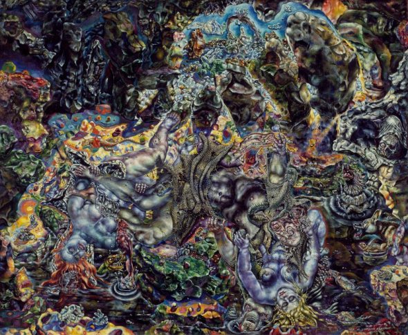
Ivan Albright
Posted: June 2, 2018 Filed under: Uncategorized 1 Comment
Just returned from Chicago where, among other things, I saw about 20 paintings by Ivan Albright at the Chicago Art Museum. Albright’s work is about as different from my own as I can imagine, but these paintings were probably some of the most inspirational things I have seen in a museum so far this year. Above is “Picture of Dorian Grey,” made for a 1945 film. An artist friend told me that looking at these paintings made him feel high — I loved them but after a while I had to stop looking and go and digest what I had seen.
Albright apparently spent between 2 years and 10 years on a single painting — which is difficult for me to imagine, but also kind of throws down the gauntlet. If I was willing to invest so much more time in a single painting, painting and repainting till I got it right, what would I have? In contrast, I feel like I rush through the creative process… usually chasing deadlines. I want to try to slow down and take more time… become more deliberate.
More info from The Chicago Sun Times.