Ivan Albright
Posted: June 2, 2018 Filed under: Uncategorized 1 Comment
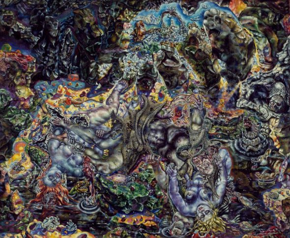
Just returned from Chicago where, among other things, I saw about 20 paintings by Ivan Albright at the Chicago Art Museum. Albright’s work is about as different from my own as I can imagine, but these paintings were probably some of the most inspirational things I have seen in a museum so far this year. Above is “Picture of Dorian Grey,” made for a 1945 film. An artist friend told me that looking at these paintings made him feel high — I loved them but after a while I had to stop looking and go and digest what I had seen.
Albright apparently spent between 2 years and 10 years on a single painting — which is difficult for me to imagine, but also kind of throws down the gauntlet. If I was willing to invest so much more time in a single painting, painting and repainting till I got it right, what would I have? In contrast, I feel like I rush through the creative process… usually chasing deadlines. I want to try to slow down and take more time… become more deliberate.
More info from The Chicago Sun Times.
The Barbarian King
Posted: May 22, 2018 Filed under: Uncategorized 1 Comment
Just got my copy of Gabor Lux’s “The Barbarian King” from E.M.D.T. (First Hungarian D20 Society) in the mail… LINK. Spoiler alert: stay away from the bear statues!

Beyond Fomalhaut: The Barbarian King
Posted: May 10, 2018 Filed under: Uncategorized 1 CommentGabor Lux has just announced that “The Barbarian King” is now on sale. AFAIK ships worldwide from his native Hungary. I’ve done a couple of things with Gabor and hope to do a few more… check out his website for more info.

A legionary discovers that all is not well at the temple of Mitra… the most compelling evidence being that the priest has been infested by some root-thing that wants to eat his brains.
The Stag God (2)
Posted: May 6, 2018 Filed under: Uncategorized Leave a comment
More finished version of a work in progress I posted earlier. Created for Le Deiu Cerf.
The Stag God
Posted: May 6, 2018 Filed under: Uncategorized Leave a comment
Work in progress
A private commission currently on my drafting table for a cassette tape label. A welcome departure from what I have been doing lately. Check out “Le Dieu Cerf” on SoundCloud…
Ship cut-away drawing
Posted: April 22, 2018 Filed under: Uncategorized 2 Comments
Part of a work-in-progress for a diagram describing the layout of a lanteen rigged caravel that sails the seas of a fantasy world. I’ve always loved cut-away views of buildings, ships and similar things as a means of visually understanding historical things like ships, fortresses, etc. The hull of this ship is expanded vertically, making the distance from the keel to the main deck appear greater than it might be in a blueprint of a similar ship. This distortion was necessary in order to show all of the rooms and passages in relationship to one another. One of the purposes of this diagram is to show the reader how one gets around the ship… for instance, in order to get from the galley(13) to the captain’s stateroom(5), one needs to take the stairs up to 10, pass through the door to the hallway leading to 8, take another stair up to 4, then pass through the door between 6 and 7 to get to the stateroom (5).
Sailing enthusiasts will probably take issue with the liberties I have taken in portraying the rigging. In my defense, a) I’m not being paid enough to research a 100% accurate ship, b) If I drew every rope and pulley accurately, I would miss my deadline by about a year, c) it’s a fantasy ship, so of course there are differences between this and historical ships, and d) I wanted to give the critics an opportunity to show off their knowledge of the rigging of 15th century Portuguese historical ships by giving them something to criticize.
Dungeon Alphabet 4th Printing
Posted: April 21, 2018 Filed under: Uncategorized Leave a comment
Goodman Games just shipped me my copy of the 4th printing of ‘Dungeon Alphabet’ by Michael Curtis. The 4th printing includes more pages and entries for your reading pleasure with illustrations by Brad McDevitt, Jeff Easley, Jim Holloway, Doug Kovacs, William McAusland, Jesse Mohn, Peter Mullen, Russ Nicholson, Erol Otus, Jim Roslof, Chad Sergesketter, Chuck Whelon, Mike Wilson and myself. One of the new pages includes this 11×17 inch fold out map by me (above). Hoping one day Goodman will let me turn it into some kind of “Where’s Waldo” type poster.
Underground Comics
Posted: April 16, 2018 Filed under: Uncategorized 1 CommentTrey Causey tells us that issue #1 of ‘Underground Comics’ is almost here. My 8 page comic, “The Stone God,” makes it’s first appearance anywhere in its pages. 36-pages and 6 black and white features of dungeon-related stuff. Artists/authors include Jeff Call, James V. West, Karl Stjernberg, Jason Sholtis, Luka Rejec, and myself. Watch Trey’s blog (“From the Sorcerer’s Skull”) for more info.

Cat Attack
Posted: April 5, 2018 Filed under: Uncategorized Leave a commentRecently I was asked to do a painting for Goodman’s ‘Lankhmar’ series of adventures that involved a ‘Land of the Giants’ theme. (Anyone else remember ‘Land of the Giants’?) I wanted to share how I ended up with this image:

I’d been given suggestions as to subject and started with rough sketches. The one I liked most looked like this:

Admittedly, pretty rough, but I’m trying to figure out how to tell the story (the people are small and the room is giant-sized). The window in the upper RH corner provides the light to the scene and the darkened LH corner provides a place for test to go. The middle figure is holding a dinner fork. The client suggested the ‘fork’ should look more like a real dinner fork (I actually based its design on a medieval fork I saw once, but I take his point — to most people, this version just looks like a very impractical pole-arm and since I wanted to suggest that the character had picked up a fork to fight with like characters from ‘Land of the Giants’ defended themselves with giant sized pencils, cutlery or scissors, I needed to make that clear). I thought the cat looked to small and the adventurers looked too big. Goodman also asked that I think of a way to inject the idea that this adventure was taking place in an urban environment…

I did more sketches and some color studies (which I am not showing here). Then I began to commit to paint. You can see that I made the cat bigger and scarier looking and the character figures much smaller. I opened the window to show the city outside and added some furnishings in the background to make it clear they are inside a giant house. This was good but it wasn’t quite there yet… I put the painting away for a day and came back to it:

Which gets us to where the painting is at present. I deepened the shadows and added more blue/cool colors to indicate that Lankhmar is a dirty, damp and wet city… just as Fritz Lieber intended. I deepened the shadows and added more contrast to the figures.